My process at Florida Blue complements the SAFe Agile framework. Building on insights gained from user feedback using an iterative cycle. Learning from every sprint, strengthening the project solution as time passes. Adding to and tweaking until every aspect of the solution is optimized to solve users' problems while meeting the Business's goals.
NOTE
The work presented is altered to avoid showing any Protected Health Information (PHI).
Objective
I see myself as a voice for the end-user by using research to understand the user's goals and problems. Allowing the insights gained to drive an appropriate solution. That solves the user's problems and meets the business goals.
Building a foundation
Starting a Sprint 0, I am looking to discover the core problems we are trying to solve and learn as much about our users as possible. Stakeholders are my go-to resource for a high-level understanding of the project and typically the first interview I set up.
Stakeholder Interview
I start this meeting by trying to understand the vision for the project. Understanding where the project will go helps to frame the project's needs for me. The second item is the problems were are trying to solve. So I know what the Business goals for the project are. The third item is a high-level process as they see it, giving me a foundation for my Journey Map. Finally, I ask for a hand full of Users that I can interview to understand who they are.
User Round Table
Meeting with the End-Users, I try to understand basic details like the level of education—their technical and Business knowledge—roles and responsibilities within the team. Who they work with and how they coordinate work. All the details gathered from this meeting build the Personas for the project.
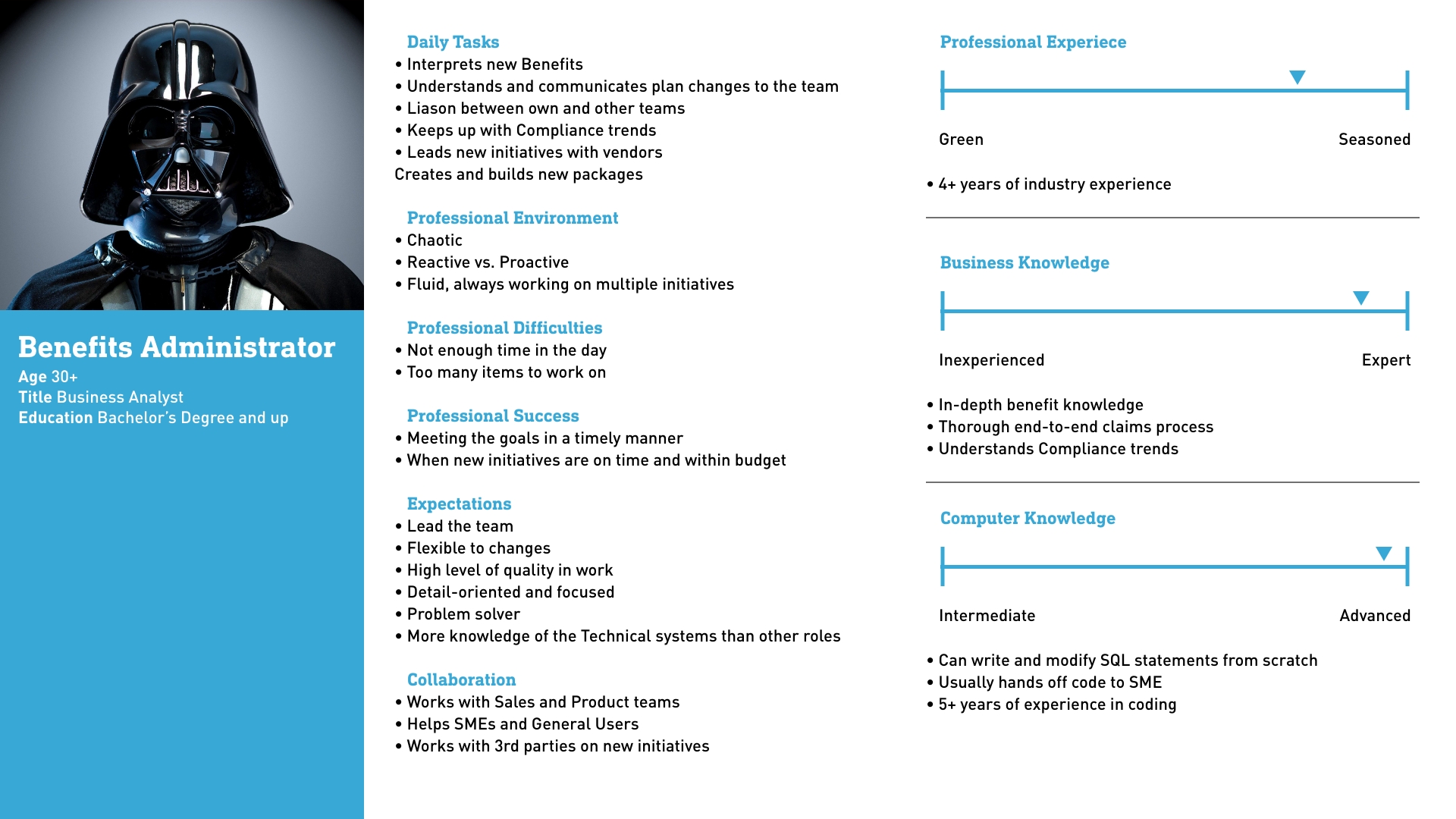
An example of a Persona I would create for a Project.
User Shadowing
Next, I sit down with an SME that walks me through the work process in detail. I'm looking to capture the User's Tasks and Goals and see how they operate—looking for usability issues they may not notice. Sometimes gaps in the experience come up. For example, I noticed that Users were downloading a spreadsheet to their desktop. Then they would upload the same spreadsheet to another system, known as a human API.
Journey Map
The primary goal of the feedback is to take the goals/tasks with the personas to build a Journey Map. The insights gained from finding gaps get taken back to the stakeholders for review. So they can be considered as part of the scope of the project.
Two Journey Maps get created from the meetings. First is the current flow in today's world. The second shows an ideal flow of what the process would look like at the end, a future state. Creating a future state flow helps to make sure the direction of the UX aligns with the stakeholder's vision of the project. Having a quick review helps to alleviate pain points down the road. Sometimes it helps to create new ideas for how the process could be.
User Flows
I use the Journey Map as the backbone. Tasks from the future state Journey Map are broken down and isolated. I sit down with the Business Analyst and brainstorm. Asking, "As a user, I need <blank> to complete task <x>." Filling in the blanks draws a rough sketch of how the application should function. From this, the needed functionality starts to get defined.
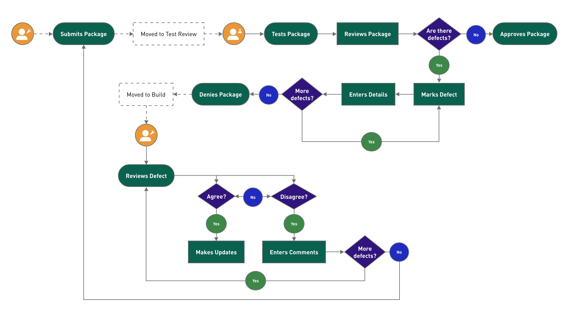
A User Flow showing how two roles interact in an approval process.
Defining functionality
User Flows get dissected to define the needed functionality and the UI elements on the screen. Collaborating with the Business Analyst, we start to flesh out the functionality by asking questions, "If a user creates an item. What if they made a mistake? We need to include a Delete function". We take the UX from theory to reality in this step.
Site Flow
With the functionality and process defined, I start mapping out the app's structure and where the content will live on what pages—using high simple icons that represent different types of pages. At the same time, I define high-level requirements for the app structure. For example, I highlight where certain Users have access, and others don't. The application starts to take shape, creating a runway for the Wireframes.
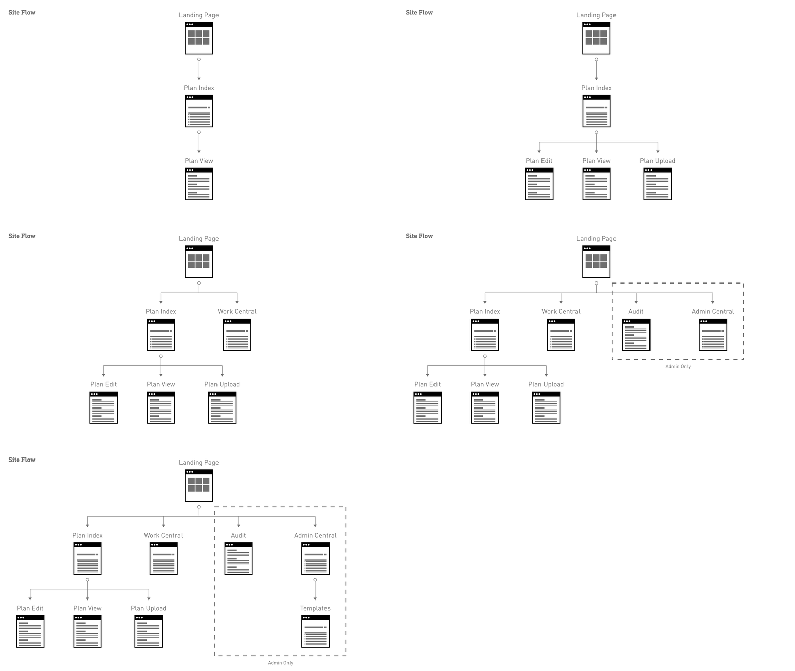
Evolution of a Site Flow, through multiple sprints.
Wireframes
I am using the defined elements from brainstorming. I start drawing the wireframes for the feature. The goal is to move fast and work through many options as quickly as possible. I am not trying to be perfect want to come to a solid solution. Ultimately, this is just the start of the process. There is no need to get stuck on the details, as the design will continue to adapt and evolve through the process.
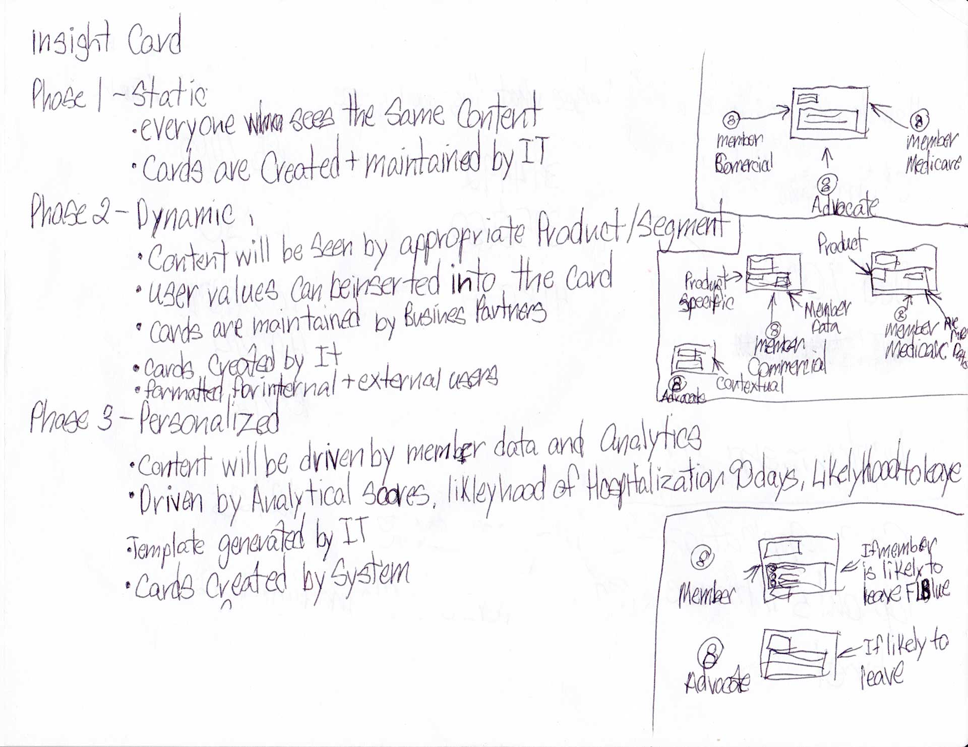
I start with a Wireframe before moving into detailed UI work like Mockups.
Mockups
With the needed UI elements identified. I lean on the component library that my team has set for all the apps in the department. We leverage our components from the enterprise standards and build on top. We incorporate UI elements and colors that are unique to our area.
UI Stress Testing
I grab the components that I need. I start to insert realistic data into the fields. So we have the appropriate element in place to make sure the UI won't break. An example is taking a person with the longest name and placing it in the mockup to ensure it won't break the layout. Or I learn about how many instances of a component we will have. If there are a few components, a card might be appropriate. If there are a lot, a table might be a better solution.
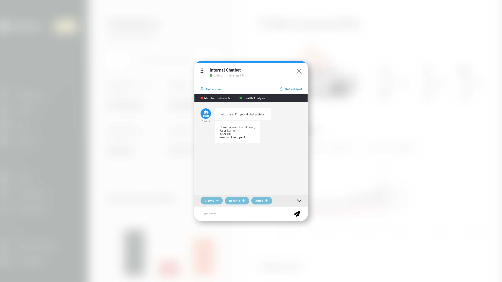
Example of a mockup that would be created for a project.
Mockup Prototype
The Prototype allows me to do two things. First, review with the stakeholders to ensure we solve the correct problems and align with the project's vision. Second, I User Test with the end-users, ensuring the flow is intuitive. Now is the best time in the project to make changes because there hasn't been a single line of code committed. The Prototype reduces technical debt as a result.
Proof of Concept that shows the flow for the expected end state. Good for user testing before code has started.
Grooming Process
With a solid foundation built, I work with a Business Analyst and Product Owner. We review the Prototype to break down the features into stories by breaking the UI and functionality into pieces. Ensures we don't have any amount of work that is too large for our developers. Grooming is still a flexible process as adjustments can still be made to the scope of a story while in the Grooming Sessions.
During Grooming Sessions, I work with developers to make updates to the mockups. That keeps the project within scope and technically achievable. Sometimes new ideas for the product come out of these sessions. They may be tweaks, changes, or completely new features that the Product Owner likes. I work with the Business Analyst to capture the new requirements. Build updated or new mockups that are labeled "Advanced Functionality." The functionality has a Users Story created and then moved to the backlog for prioritization.
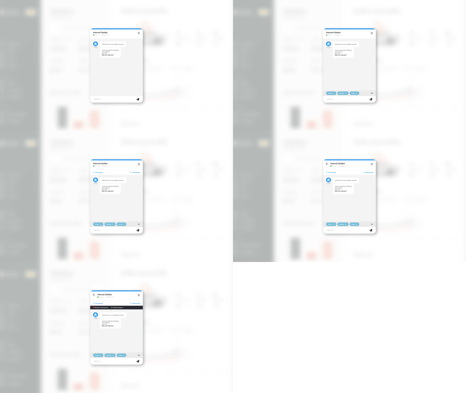
Evolution of the UI once a feature has been broken up based on priority.
Sprint Support
I support the developers by handing over the values they need to build the solution and answering questions about how interactions should work or the exact color. QA comes to me to validate that the Product is working as expected. So they can report the correct page a broken link should go. Sometimes they find Usability issues that I work back with the Product Owner to address severity and priority.
Post Release support
I set up usability sessions with Users to check for any experience gaps. Sometimes users complete their tasks in unexpected ways. Meaning the Product is not optimized for how they work. I gather feedback on the process and work on a quick solution to share with the Product Owner to create a User Story.
About every quarter, I have a round table session with Users to understand their perception of the Product and the pain points they are experiencing. Similar to the usability sessions, I work back with the Product Owner to address any issues from the session.
Restarting the loop
After Sprint 0, I am constantly coordinating with Business Analysts of the project to create mockups for upcoming User Stories to help keep us N+2. While gathering usability feedback to help improve the Product.
In summary
I have been fortunate enough to learn how to Design within an Agile framework at Florida Blue. With only Waterfall experience before. With Agile, we can put something in front of a User and constantly improve it until it is fully optimized. I like seeing the project evolve and grow and not spending hours and hours on minute details. Having that flexibility complements the design process, ensuring success at my job.
Featured Case Study
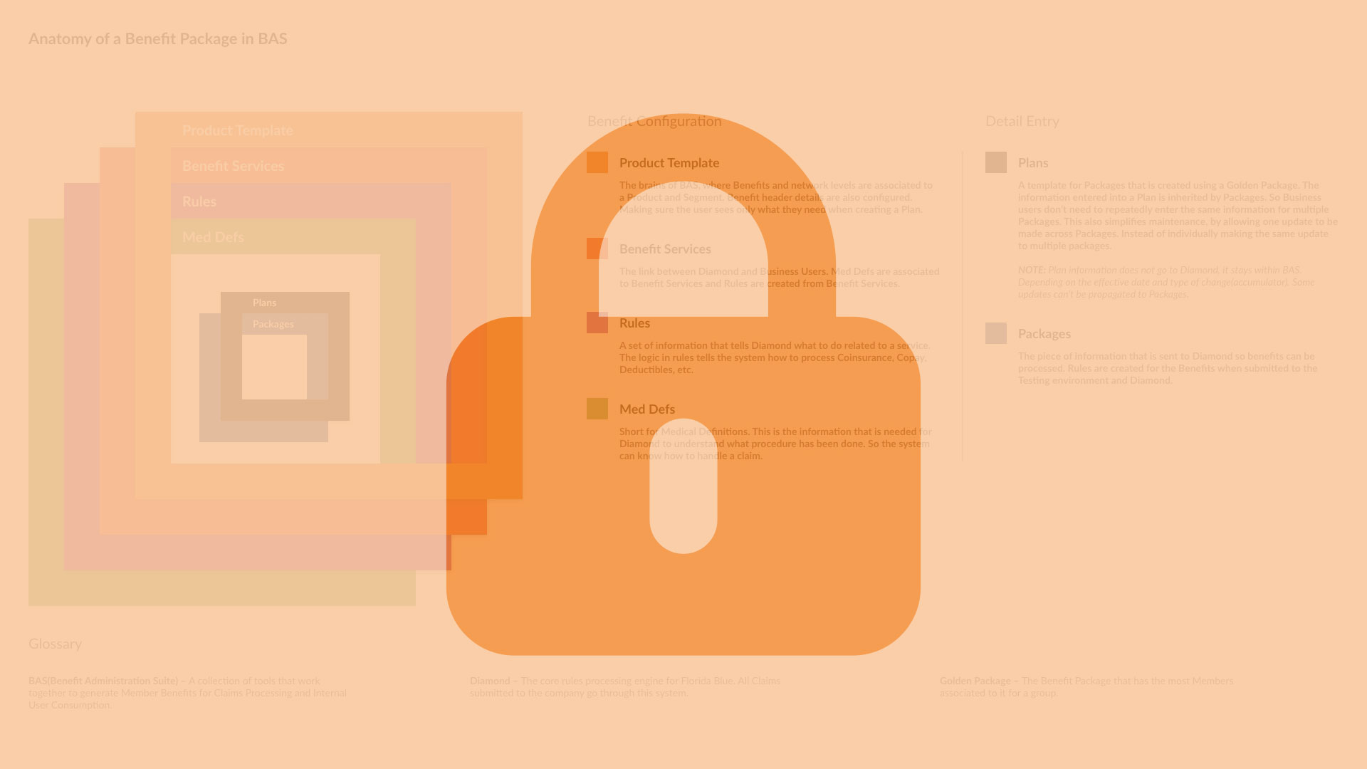
Benefit Administration Suite
A walkthrough of an application I designed from the ground up. That creates rules for Benefits to be processed and generates a user-friendly version of the Benefits at the same time.
About
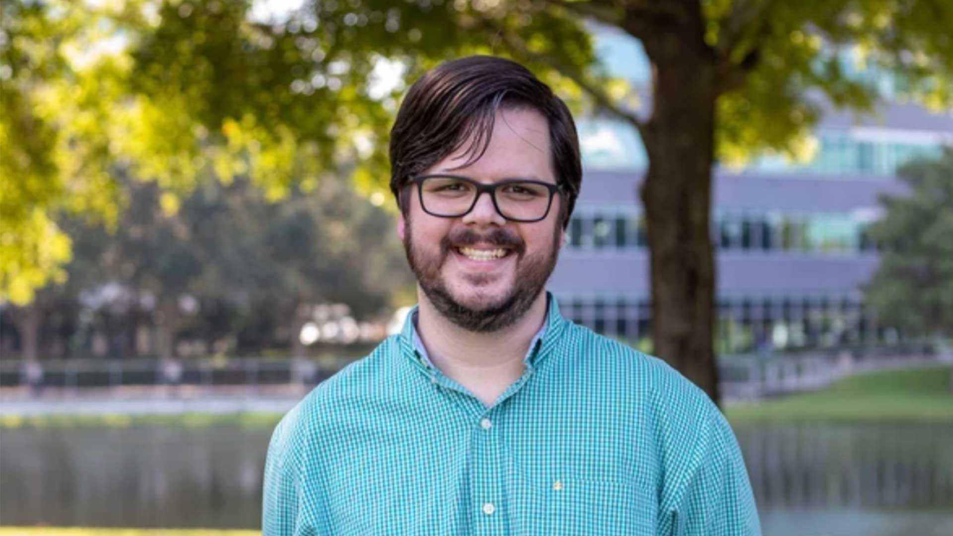
From Tigers to Jaguars, I am more than a UX/UI designer. Discover the entire picture of who I am.