Benefit Narratives is a web application that contains detailed information on every Benefit Package that Florida Blue offers. It is referenced if a Member wants to know what they should be paying for a service for example. But it is solely used by internal employees.
NOTE
Due to the sensitive nature of working with Protected Health Information (PHI). The work represented has been altered to avoid any violations.
Objective
We were replacing a 16+ year old HTML site that a team of four was manually updating. That took a long time to update. Riddled with inconsistent formatting and wording. Updates were commonly missed for all impacted benefits. There were many communication gaps in the app that caused confusion between different departments.
Project Contributions
For this project I created Personas, User Flows, Site Flows, Decision Trees, Mind Maps, Wireframes, and UI Mockups.
Users
Every Employee was impacted by this application. As it was the source of truth for displaying a breakdown of all Benefits. According to the site Analytics the site received 3 million hits a week. From researching the user base. Call Center Employees, and Claims Researchers were primary users. Sales, and Product were secondary users. These groups were created to help focus the solutions we created. So as to not boil the ocean, creating analysis paralysis. Tying to create a solution for everyone and no one at the same time.
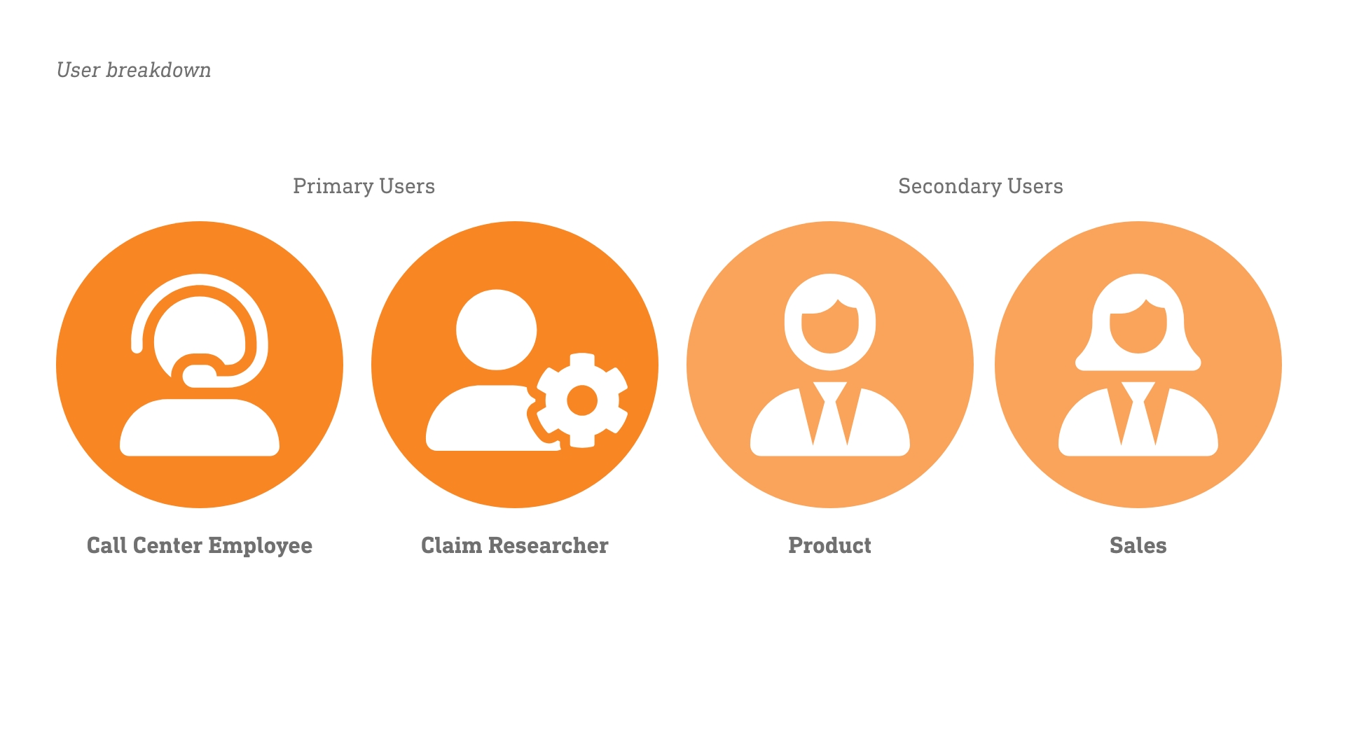
Primary and Secondary user groups, identified for the project.
Process
User Interview
I sat down with members from the primary user groups. One of the highlights from the session. Was the discrepancy of vernacular between the different groups in the company. For example, a person who works a call might use the term “Cancer” to refer to a Service when working with a customer. But for someone who works to resolve claim issues with Providers “Oncology” might be the primary name for a Service. When looking through multiple packages with a Business Analyst. We discovered some packages had “Cancer” while others contained “Oncology”. There was no rhyme or reason for choosing one or the other. We believed it was a matter of preference based on the person who created the copy.
The core problem being the users were having to jump between contexts in our application. Reducing their cognitive load by making them search for multiple synonyms for a term just to get back the results they wanted. All this why a Customer might be on a call or the decision to pay a claim or not was in the balance.
Brainstorming a solution
Working with a Business Analyst and Technical Architect. We created a mind map of sorts. Highlighting the most popular terms and other terms related to them. The architect created a way to link the words together so it would bring back results for anything that hit in that word group. This solution would stop the users from having to constantly context switch. While giving flexibility for the content to be created however needed.
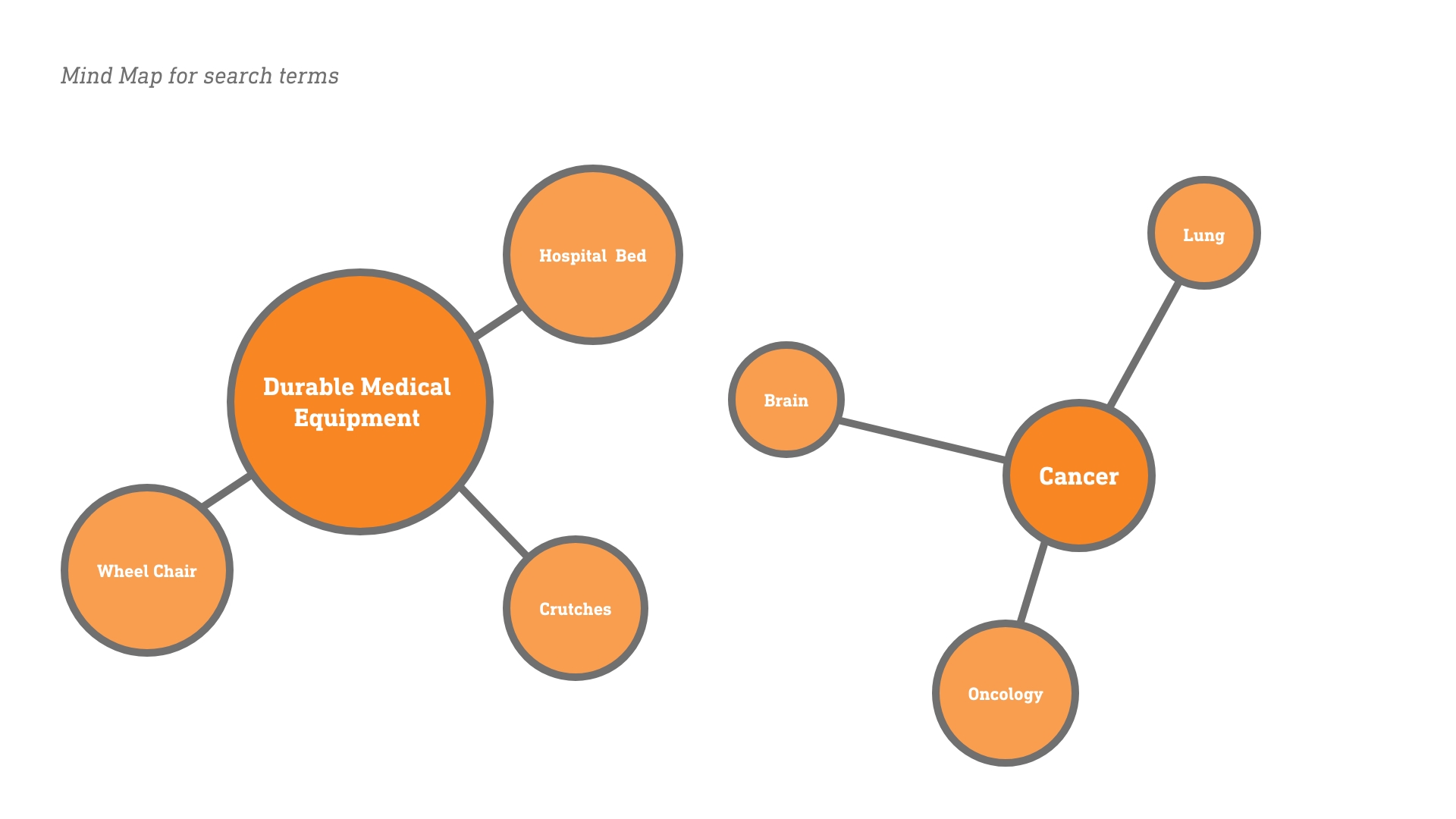
Example of some of the terms we would use for the mind map.
Beyond the context switching. We realized some services were broken up into multiple areas that were needed to give full context to what would be covered and how it would be covered. For example, there might be a service for “Durable Medical” equipment. But the items related to that service might be nested in a different section as a note. So a user who needed to know about a specific part of a service might miss an important detail by only looking at the parent service. So we added those related items to our mind map.
Creating a foundation
Once we were all on the same page for the solution. The Business Analyst put together an initial related keyword dument while our Architect worked on the technical structure. As I created wireframes and mockups for the feature. Once we had the mockups, we met with the project stakeholders to highlight the problems we found and show the solution we came up with. Once we had buy-in work started on the functionality.
The initial version of the mockups.
Fine Tuning our solution
We noticed that the search was pulling a lot of results back. Due to opening up the relevant term matches. While they were all relevant. Our users were having to go through multiple results to find the context they needed. Making them click in and click out of sections starting from the top to the bottom. Based on our testing with them.
We realized that we needed to add more context to the search results and give the results a hierarchy. So the users could find what they need as quickly as possible. I gathered that users preferred to go to a Service with a keyword in the name over one with the name in the body. Because they were more likely to find high level details they needed. Like how the claim should be processed. Then they preferred to see items that mentioned the keyword for deep research.
We brainstormed a pointing system that would rank results based on certain criteria. For example, If the keyword was in the headline the result would get 5 points. If the keyword was in the body it would get 1 point. This system helped to create more natural results for the users.
Updating the solution
As the Business Analyst and Architect worked to create a technical solution. I added contextual details to the wireframes. Like the text blurb of where the keyword shows up or a description of the service if there is no match in the body. Highlighting the keyword matches in the results by making them bold. All in an effort to reduce the scanning and research time for the user.
Mockup flow with the updated results screen.
After testing the updated solution. We were successful in adding clarity to the results and helped to prioritize the correct results. The solution then went into protection after.
Outcome
We were able to greatly reduce the research time for our Primary Users. Who used to go to multiple applications to find all the pieces of information they needed. We reduced the amount of null results as well. Now that the users didn’t have to context switch and try multiple variants of a term to find the results they need.
Summary
This process taught me how to think of a solution through multiple perspectives. If I had just used one user group. I would have solved only their problem. To the detriment of all the other users. By stepping back and learning from multiple groups. I was able to see gaps that might not have been visible otherwise. It is good to know what impacts your choices have on other user groups. To make sure you aren’t hurting your metrics by being short sighted.
Related Case Study
Benefit Administration Suite
A walkthrough of an application I designed from the ground up. That creates rules for Benefits to be processed and generates a user-friendly version of the Benefits at the same time.
About

From Tigers to Jaguars, I am more than a UX/UI designer. Discover the entire picture of who I am.