Accumwise was the result of an innovation contest hosted by Florida Blue. We competed with a handful of teams. During a two-week design sprint that tested and expanded our core idea. This is how we came to our final solution. That won us the competition.
NOTE
Due to the sensitive nature of working with Protected Health Information (PHI). The work represented has been altered to avoid any violations.
Objective
Originally, our goal was to create a new way for customers to see their accumulation details in a new way. But pivoted to a solution that helped customers use their Benefits more wisely based on how they use their Benefits.
Project Contributions
• Customer Profile
• Value Map
• Value Proposition
• Online Survey
• Wireframes
• Mockups
• app branding
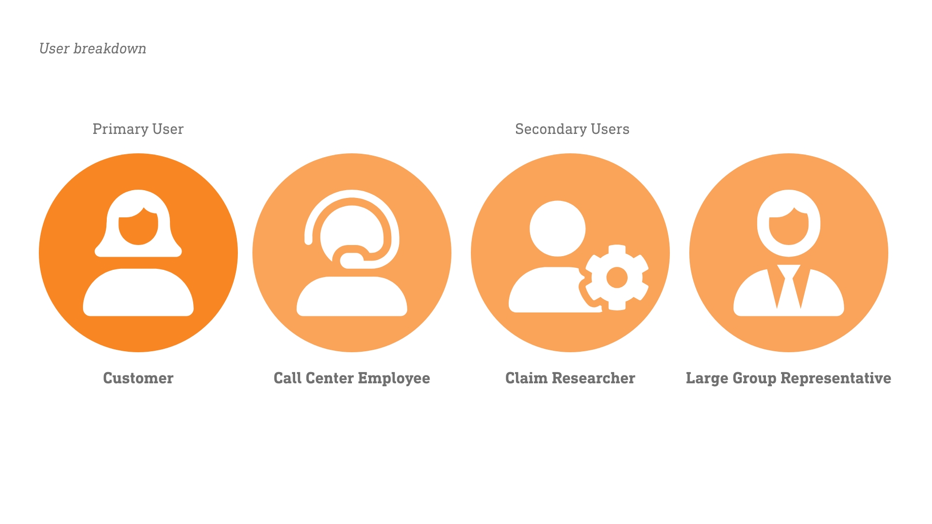
There were four user groups identified during the research phase.
Process
Making the cut
This project started as a simple idea to give a new way for Users to view Benefits. I worked with the creator of the idea to refine the pitch deck that we used to post in the innovation portal. After going back and forth over the changes. The write-up of the idea was posted and internal employees reviewed and voted on the ideas they liked the most. We were fortunate enough to make it to the next round of the competition. We were assigned an innovation coach and asked to perform a design sprint to unlock the idea's true potential.
Customer Profile
We started by envisioning who would benefit the most from our project. We identified our Customers, as at the time there was no way to view Accumulator details in the customer portal. Users used to have to call in and a script would have to be run to find a Customer’s current Deductible. Large Group Representatives were identified because they could see at a high level how their employees were using their benefits and make adjustments that improve the Benefits based on how their employees use their Benefits. Lastly, Internal employees who answer calls and adjust claims. Would benefit by having a faster way to view Customer's Accumulator details. Meaning they would no longer need to have the technical ability to run a script when they needed the data.
With the user-defined. We sat down and brainstormed their tasks that were related to the project, the pains they go through in those tasks, and the benefits they would receive from the project. Once defined, we moved on to create Value Maps based on the profiles.
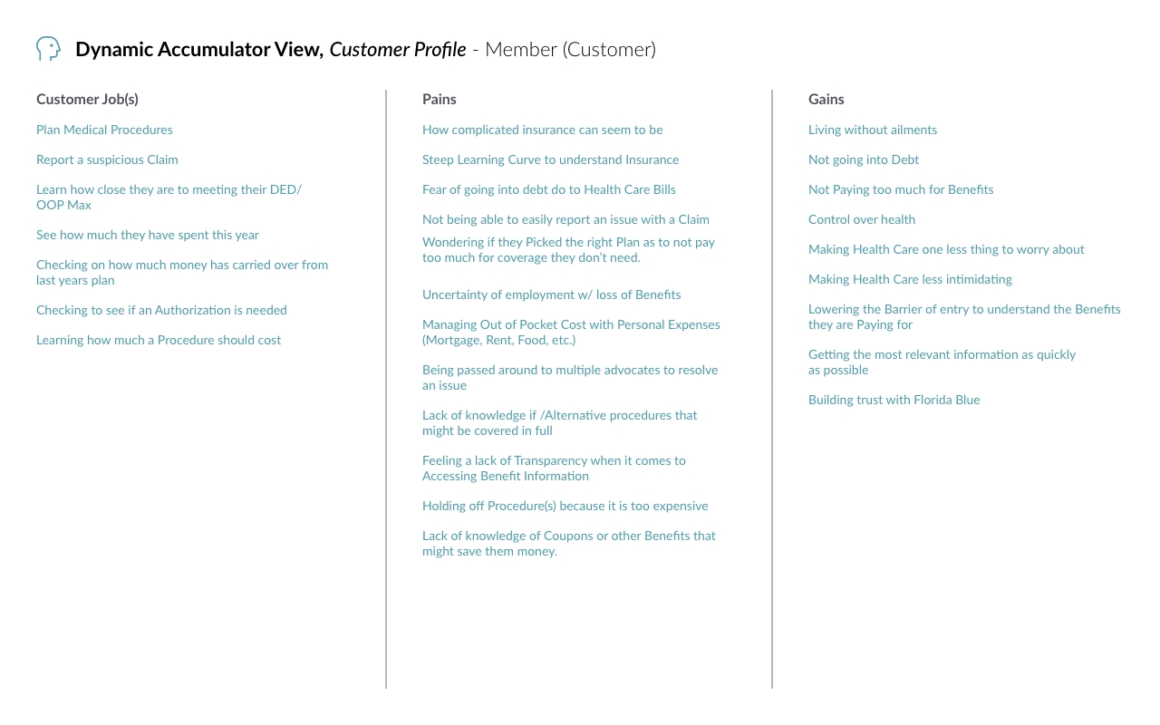
Example of a Custer Profile we created.
Value Map
Using the Customer Profile, we looked at the products and services Blue offers that could help our users. We then envisioned ways we could add value to the Custers. With new opportunities to solve their problems. This helped us to focus on the tools that we already have that can solve the users' problems and if we need to modify or create a completely new solution.
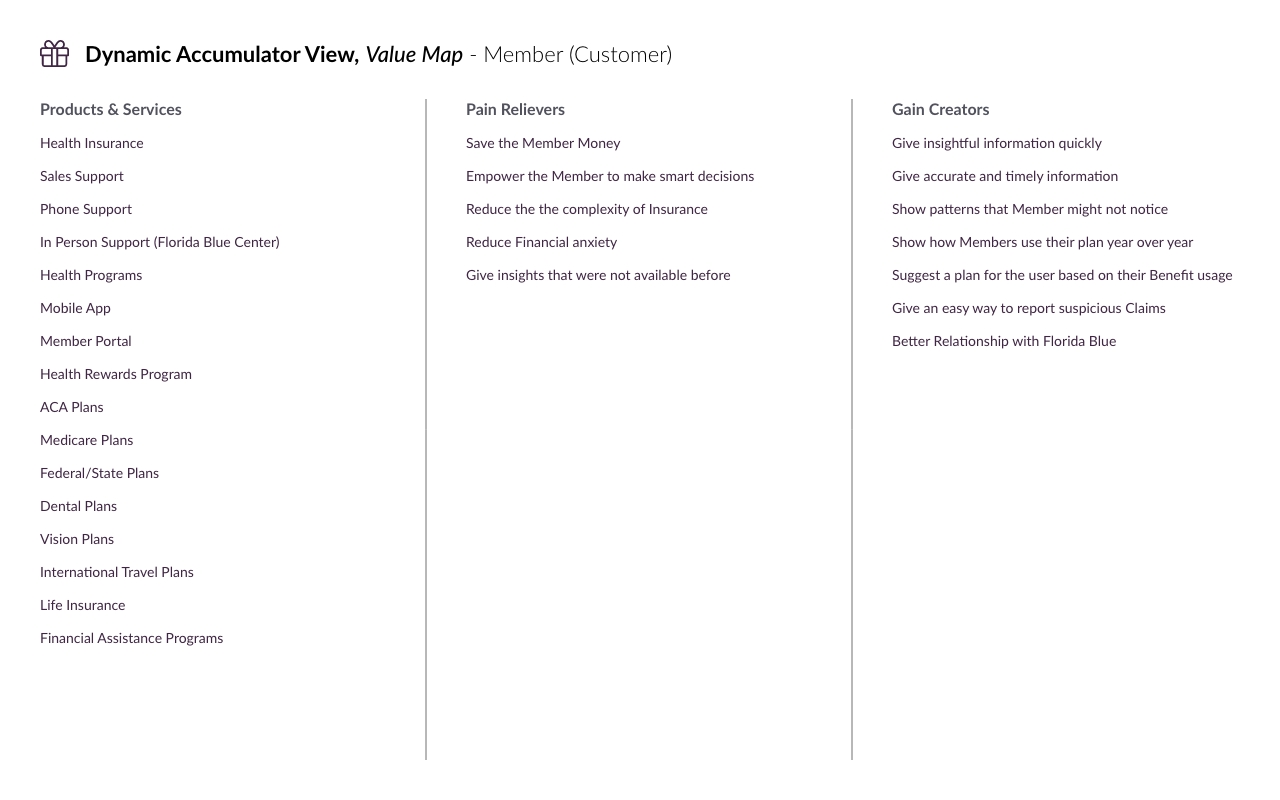
The Value Map we created for our Customers.
Value Proposition
Building on the previous documents. We added context to the problems users were facing. We started focusing on the steep learning curve for understanding how Insurance works and the problems Customers face with Medical Debt. Our focus shifted from creating a new way to view Insurance details. So how can we present this information in a way that we can help customers save money and choose Benefits that fit their needs?
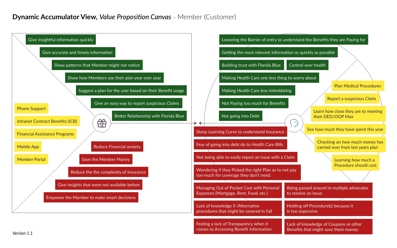
Customer Value Proposition
The Pivot
We were reviewing accumulator data with our coach. Explaining why a Member should have a different plan based on a data point from a single Claim. He told us that just because we could look at a single data point and make that determination. This did not mean the average Customer understood. He highlighted our expertise and confirmation biases. Then he challenged us to show the information in a way that could spell out what we saw.
The Mentor
This made me think back to when I first started at the company. Every conversation was over my head and my eyes glazed over in every meeting. It was a real struggle to follow because there were so many rules and even more exceptions to those rules. I was fortunate to have a Business Analyst who took me under her wings. She explained in simple terms why and how Claims worked. She even gave awesome advice on how to get the most out of my Benefit. She highlighted things I had never thought about. But when I saw them it made total sense.
I pitched the idea of having a tool that could highlight ways Members could maximize and save. The same way my Mentor had helped me. The team loved the idea and agreed that we should pivot to this solution. We were still providing a new way to view benefits. We were just adding context to the information for the benefit of our customers.
Getting ready for the final presentation
Now that we had our documentation created and our vision for the project complete. We started by gathering the data that we needed and putting together the initial designs. This is where we started thinking about how this could technically be done. Focused on reducing medical debt for our members we wanted to have the users land on a page that showed a breakdown of a member's Deductible and Out of Pocket expenses. By highlighting where the money was being spent. We wanted to add insight into where a customer's money was going.
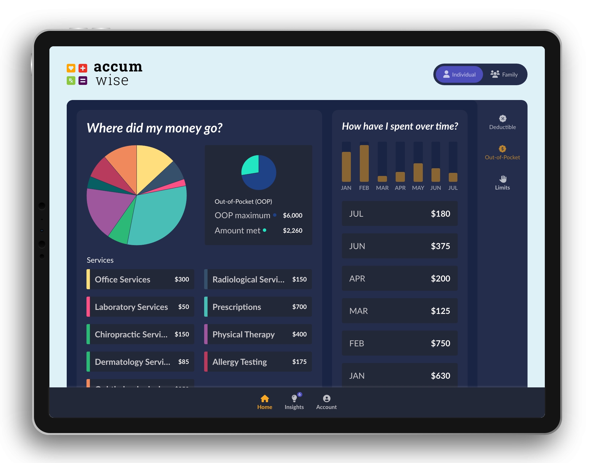
Out-of-Pocket View
Next, we wanted to show the Customer's limits simply and straightforwardly. It needed to be laid out in a way that a customer could quickly scan the page and understand how many Doctor Visits they had left for example. This page was informed by our understanding that we needed to add context to the screens and not just assume a Member knew everything related to a service like home health care.
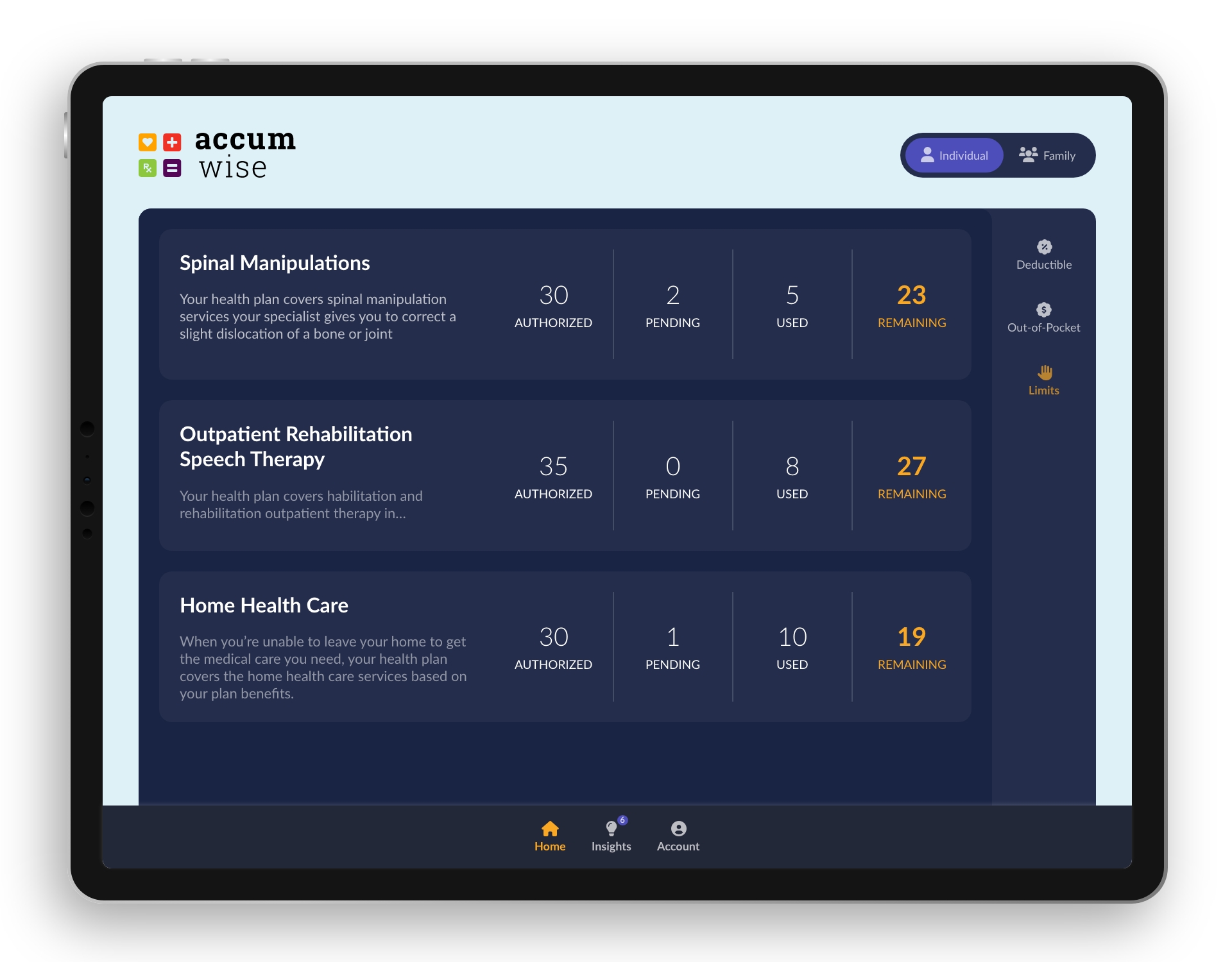
Limits view
We started cooking with the insights section of the app. This is where we started thinking like a mentor. We started asking “What would be important information for a customer to know from the primary screens?” “What should the Customer learn from looking at the breakdown of their Benefits?” With this framing, we started coming up with different types of insights we could give the Member.
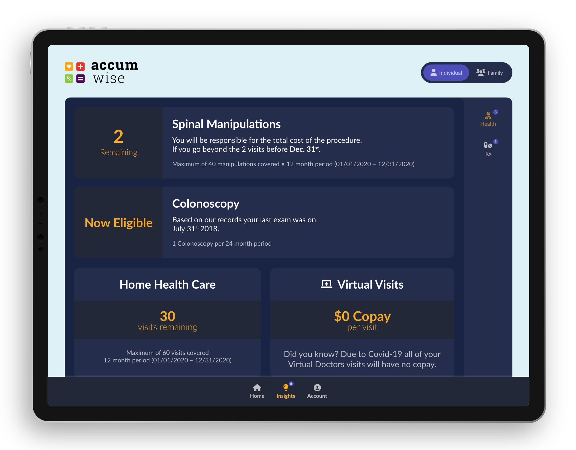
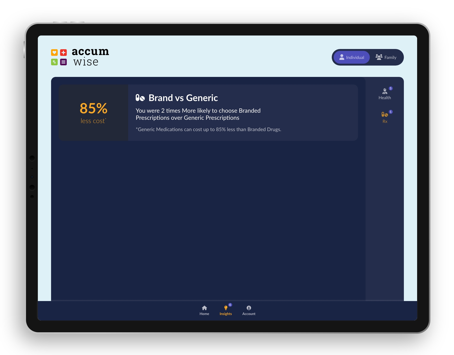
Health and Rx Insights pages
Outcome
We one the Innovation competition and the project was incorporated internally and externally into Florida Blue systems.
Summary
I learned that I have to make myself open to other ways to solve a problem. Not just fall in love with an idea and stick with it from start to finish just because. If it can be added to or enhanced. I need to be open to accepting it. The problems we are familiar with might not be the same problems the end-user has. It takes listening to an outside voice to give perspective to a solution.
Related Case Study
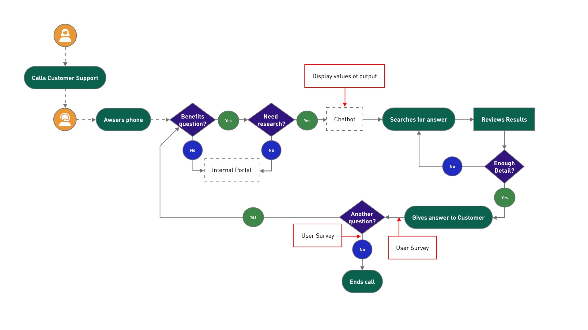
Chatbot IA Proof of Concept (POC)
This Case Study walks you through the process of integrating the output of an algorithm into an internal chatbot.
About

From Tigers to Jaguars, I am more than a UX/UI designer. Discover the entire picture of who I am.